Conversation
🦋 Changeset detectedLatest commit: f84874e The changes in this PR will be included in the next version bump. This PR includes changesets to release 1 package
Not sure what this means? Click here to learn what changesets are. Click here if you're a maintainer who wants to add another changeset to this PR |
 simurai
left a comment
simurai
left a comment
simurai
left a comment
There was a problem hiding this comment.
🎯
Some things that jumped out when browsing through the docs:
The focus outline is lost when pressing space for certain components. E.g. btn-primary:
Screen.Recording.2021-11-10.at.12.15.06.mov
I guess because it uses box-shadow: inset for the :active state? Not sure if it's something to worry about? 🤔
Should we include summary? Like when used to open a dropdown. Currently it uses the default browser focus style. Which looks pretty similar in Chrome, but without the 2px gap:

Also, select. And maybe there are more focusable elements?
Is it weird that when an input and button is combined, the button has a 2px gap, but the input not:
Screen.Recording.2021-11-10.at.12.26.41.mov
For the inputs in the proposal it seems to not show a gray border when focused:

Not sure how important that is, but without the gray border it looks a bit sharper. Maybe we could use
box-shadow: 0 0 0 1px var(--color-accent-fg);
border-color: var(--color-accent-fg);
There is something super weird in Chrome with inputs disappearing when focused. It seems related to position: relative. Maybe some browser bug? 🤔
Screen.Recording.2021-11-10.at.12.38.39.mov
…nto global-focus-styles
|
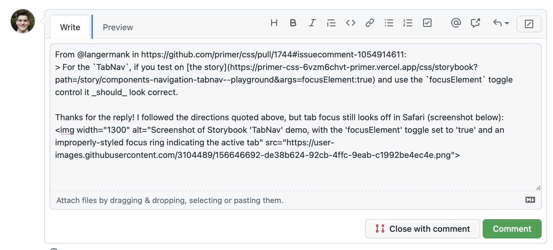
From @smockle in #1744 (comment):
Follow-up from https://github.com/github/design-infrastructure/discussions/2258#discussioncomment-2327234:
|
This comment was marked as resolved.
This comment was marked as resolved.
|
👋 This PR is ready for review after taking time to test directly in GitHub! 🎉 Please look for commented out code/redundant code I may have missed. For Hubbers, feel free to cross reference specific design decisions with this discussion. |
|
@langermank gloss/marketing already has focus styles defined, but they seem to be overridden/removed here. Can we maintain the marketing styles? |
|
@tobiasahlin this PR introduces new focus styles that increase contrast and discoverability when elements receive keyboard focus. Rather than style individual components (for example, Button used to have a focus color related to the variant color), we're using a single color token combined with varying offsets to achieve compliance. With this single token in place, we can easily modify it should we need to (perhaps we'll need to increase the contrast at some point). For Marketing, the signup button and default black gradient button focus styles are not passing. The muted and subtle buttons pass because of the darker outline, but I decided to refactor all of the focus styles for consistency. How would you like me to proceed? If the goal is for PCSS to provide accessible focus styles, should we remove the marketing specific changes or work towards compliance with those designs as well? |
|
@langermank if it's primarily about the color (to increase contrast), could we potentially use the old implementation but use the new color? (I'm mostly keen to keep the animation, position and size of the old focus state, we should of course comply like everything else 🙏 ) |
simurai
left a comment
simurai
left a comment
There was a problem hiding this comment.
Clicked a bit through the docs. The following components use a blue background for the active/selected state and therefore the focus styles are not visible? Not sure if a blocker since they are quite old and we want to move away from that blue active/selected style.

| } | ||
| } | ||
|
|
||
| a:not([class]), |
There was a problem hiding this comment.
Should the Link component be included here too? The outline-offset: -2px; can sometimes make it hard to read the link text.

Also there are probably some cases where a:not([class]) would not be effective, but still desired.. e.g. when a link is shown responsively like <a class="d-none d-md-block">Link</a>. Hard to fix without adding tons of exceptions for utility classes. 🤷
There was a problem hiding this comment.
Links are tricky! I changed this to 0px offset as a happy medium, and added that offset to the PCSS Link component. There were a lot of edge cases in dotcom where having a larger offset wasn't desirable, primarily where an additional utility or class was used. I felt like :not() was an appropriate safeguard for now.
|
@tobiasahlin the focus styles we're using on Primer primary buttons are inset, which we found helpful for condensed layouts. Would you prefer a 2px offset? See both options below: inset option marketing-focus.mp4offset 2px marketing-focus-2.mp4 |
simurai
left a comment
simurai
left a comment
There was a problem hiding this comment.
Thanks for the follow-up changes.
I'll let @tobiasahlin comment on the marketing changes #1744 (comment)... but I think the rest good to 🚢
|
@langermank yesss offset rather than inset would be great to align with the current behavior! 🙏 |
14 participants
:focusand:focus-visiblestyles fora, button, input, textarea, selectelementsoutline: 0;from primer-css (there are some special edge cases)outlineinstead ofbox-shadowwith an offset of 2px (no offset for form field elements)inputtextareabuttonradioacheckboxselectInspiration/research: https://www.sarasoueidan.com/blog/focus-indicators/
/cc @primer/css-reviewers